What Is UX/UI Design, and Is There Any Difference Between Them?

UX and UI are related and interconnected concepts, but it’s not the same thing. Due to the similar-sounding, they can often be confused by people outside of the IT field. In this article, we will tell you about UX and UI design and how they are connected.
What Is UX Design?
The term “user experience” was first used in 1993 by Donald Norman, a design and user engineering scientist. He believed that the interface should be not only functional but also evoke pleasant emotions. Thus, UX design is the creation of helpful, simple, and lovely products.

A UX designer studies people’s behavior and experience to build the site’s logic and is responsible for the user-friendliness, informativeness, and usability of the interface.
The main task of a UX designer – to think through a logical arrangement of blocks and buttons so that any user can easily interact with the application or site.
In order to study the habits of users, a UX designer applies different methods:
- Observation
To do this, the designer chooses a few people who were not involved in the development of the current project and gives them tasks they perform under the researcher’s supervision. Then the UX designer records how long it took to complete the task and which pages the user navigated to – this helps understand whether the site needs to be simplified and its logic changed.
- Involvement in the Design
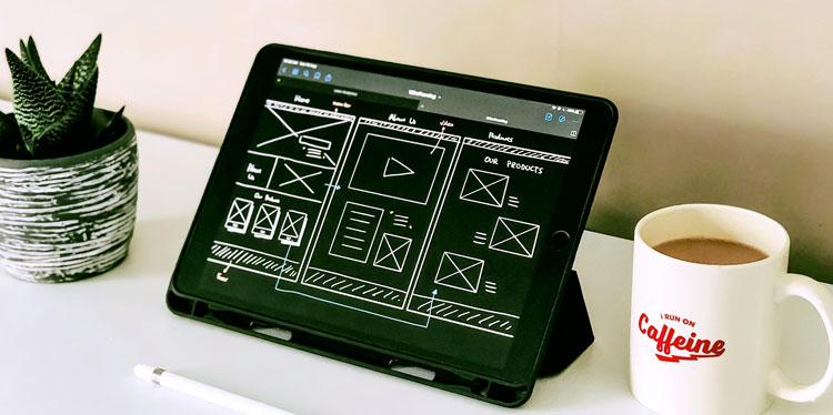
The target audience is asked to sketch the site they would like to use. From these sketches, the designer learns what features and structure the user needs.
- Interviews
The designer interviews people who have already used the product to understand what impression it leaves on the users and whether the logic of the product needs to be simplified.
When the research is done, the UX designers set the task for the UI designers or do further work themselves.
What Is UI Design?

One of the authors of the term “user interface” is Jesse Garrett – the founder of the design company called Adaptive Path. He defines UI as the scope of interface elements: buttons, text, design, and colors.
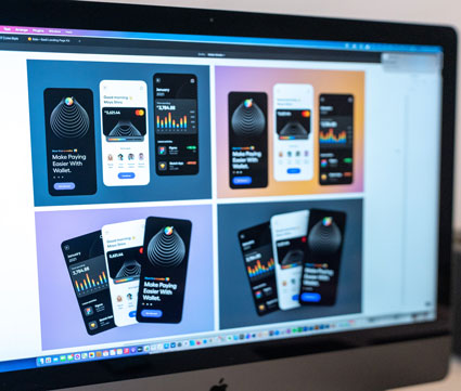
UI design represents the user experience in visual details: buttons, icons, fonts, animations, and color schemes.
The UI designer is responsible for the aesthetics, the visual appearance of the product interface, the development of the logo, and the overall corporate identity of the company. In addition, the task of the UI designer is to make the website or application user-friendly and memorable.
The Difference Between UI and UX Design
At first, the UX designer plans how the user will interact with the interface, then the UI designer thinks about what elements of design can help them with this.
UX designer – studies user habits, collects data into charts and tables, analyzes them, and designs the interface logic.
UI designer – visualizes a working prototype and makes the interface as the user sees it. The UI designer selects fonts and colors, draws buttons and animations.
The Principles of UX/UI Design
The interface design principles do not change over the years – it’s the knowledge that has no shelf life. So despite the difference between UX and UI, both specialists work to create a user-friendly interface.

Here are the basic principles in the work of UI and UX designers:
- Uniformity – all interface design elements should be easily recognizable; even if the user is on your site for the first time, the interface should be intuitive.
- Usability – all the same parts of the site should have one style and color on different pages: menus, buttons, and forms to fill out. The user shouldn’t have visual dissonance from using your digital product.
- Response – you need to communicate with the users, give them answers, visually show them what’s going on. When they read the promotional article, tell them what you want them to do – add buttons so that they navigate to the site to buy or subscribe to your social networks. When they’ve added items to the cart, remind them that they need to pay and show them what form to fill out to do so.
- Prevent Errors – think of the interface and its texts so that the user has no chance of making a mistake – build the easiest path to the goal.
- Simple Undo – think of the case when you did something in a program, and suddenly everything went wrong, and you can’t undo your action – it’s terribly stressful. So always allow users to take a step back.
- Control in the Hands of the Users – the product should have logic, and it should be obvious in advance what will happen when the button is pressed.
-
Minimize the Load on the User’s Short-Term Memory – users should not have the impression that they need to write everything down to avoid losing information. Instead, duplicate important details on each page so that a person always has the opportunity to check it rather than searching the entire site.


